
Work from the image's purpose and rendered slot, preserve an original and verify the actual responsive result; shrinking the display box alone does not prove a smaller download.
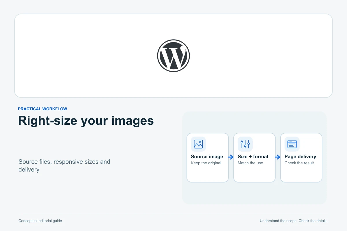
Size WordPress images for the space and purpose they have on the page, then verify what the browser actually downloads. Preserve the original, prepare a suitable crop and format, insert it through the Media Library, choose an appropriate image resolution and check desktop and mobile. Making the visible image smaller is not proof that the downloaded file became smaller.
There is no single best pixel width or file-size target for every WordPress image. A full-width photograph, a small portrait and a screenshot containing text have different needs. This is a documented workflow, with a fictional sizing example rather than a claimed performance experiment.
Before changing the library
Confirm you own or are licensed to use the image. Keep an original outside the website and a recovery set before broad media changes. For a first pass, use one synthetic draft and one image, not a bulk optimizer across every published article.
Write down where the image appears: article column, wide header, card or avatar. Check that slot at desktop and phone widths. Note whether the page also crops the image for a listing card or social preview; one file can appear in several layouts.
Open its Media Library attachment details and record the current dimensions, file type and size. Those fields describe the stored asset. They do not prove which responsive variant a visitor receives.
1. Separate source pixels from display size
The intrinsic dimensions are the pixels in the image file. The rendered dimensions are the size of its box on the page. A photograph can be thousands of pixels wide while appearing in a narrow column. CSS can shrink the box without changing the source file’s download.
MDN’s image-performance guidance explains matching the supplied image to the required display and reserving its space. Pixel density can also affect the needed source resolution, so assess sharpness on the intended devices rather than simply matching a CSS width one-for-one.
For a fictional example, an article image renders around 720 CSS pixels wide on a desktop layout. A 1440-pixel source is a candidate to inspect on a higher-density display, while the phone may use a smaller generated variant. These illustrative values are not a universal recommendation or a guarantee that WordPress selects those exact files.
2. Crop for meaning before compressing
Remove irrelevant borders or empty space when that improves the explanation. Preserve the part readers need: a face, diagram label or interface control. For screenshots, check that text remains readable after the intended resize; splitting a complex screenshot may work better than shrinking it until every label is tiny.
WordPress’s media editor distinguishes scaling and cropping and provides restoration controls. Keep the independent original anyway. A library-level edit can affect reuse, while a block’s visual crop may affect only that appearance.
Use a separate candidate for a substantial change and review every important use before replacing the published asset. A photograph cropped for a square card may lose its subject in a wide header. Do not delete the existing file until references and recovery are understood.
3. Choose and inspect a suitable format
MDN’s format guide describes the tradeoffs. JPEG remains useful for photographs; PNG can suit lossless detail and transparency. WebP and AVIF can be candidates for efficient delivery where the environment supports them. Choose by visible quality and actual output, not the extension alone.
Export a candidate with sensible dimensions and compression, then inspect edges, gradients and small text at the intended display size. Compare its file size with the original. Do not repeatedly recompress a lossy file as the master; return to the preserved source when making another variant.
Confirm upload and image processing work on your host. WordPress’s AVIF support note includes an environment requirement. Browser support does not establish server support, and renaming a file extension does not convert its format. A paid optimization plugin is optional when the existing tools already meet the need.
4. Insert from the library and choose the resolution
Add an Image block to the draft and select the intended Media Library item. In the block settings, distinguish Resolution from display Width, Height and Aspect ratio. Available resolutions depend on the theme and original upload.
Choose a file resolution that preserves the required detail without automatically requesting the largest original. Keep the aspect ratio unless a deliberate crop is part of the design. Review the focal point where the theme or block uses a cover crop, and avoid a fixed height that distorts or clips important content on phones.
WordPress’s responsive-image support can provide source candidates and sizing information for the browser. Themes, optimization plugins and custom markup can alter it. Check the delivered page rather than assuming that selecting Medium or Large always produces the right result.
5. Describe the image’s purpose
Use W3C’s alt decision tree to decide what the image contributes. An informative image needs a concise equivalent of its relevant meaning. A complex diagram also needs its essential explanation in the surrounding text. Avoid stuffing unrelated keywords into the alternative.
A purely decorative image should use empty alternative text so assistive technology can skip it. If the image is the only content of a link or button, its accessible name must communicate that function or destination. Decoration and function are different decisions.
Check the individual block’s alternative text. A library default can be useful, but the same image may serve a different purpose elsewhere. Add a visible caption when all readers need context or attribution; the filename and attachment title are not substitutes for a useful alternative.
6. Verify the real page
| Check | What to verify |
|---|---|
| Desktop and phone | Subject remains visible; labels readable; no horizontal overflow |
| Delivered resource | Correct image request, source dimensions and sensible transfer size |
| Layout | Space is reserved as the image loads; proportions remain correct |
| Meaning | Contextual alt, caption and link purpose are appropriate |
| Reuse | Article, card and header crops still work |
Use the browser’s inspection and network tools if needed to identify the selected resource. Check a fresh logged-out page after the change, with consistent cache handling. A sharper screenshot and a lower file size are useful observations; they do not establish a measured overall speed improvement.
Do not apply lazy loading blindly to every image. Below-the-fold images can be delayed, while an initially visible main image, especially the Largest Contentful Paint image, should not be held back by lazy loading. Determine the actual page behavior before changing a global setting.
If the result is wrong
If the image is blurry, compare the selected variant with the rendered size and original detail. If a crop removes the subject, adjust the specific block or restore the candidate. If the old image persists, verify the saved source and clear the relevant cache rather than uploading repeated duplicates.
If upload or processing fails, record the file type, dimensions and exact error and check host support. Do not raise server limits at random. Restore the working draft or asset when necessary, keeping the original and documenting the unresolved condition.
Common questions
Should every image be the same width?
No. Use the actual slot and required detail. Consistent design does not require identical source pixels for a portrait and a wide diagram.
Can I delete all “unattached” media?
Do not treat that label as proof that nothing uses the file. Check templates, reusable content and plugin references before removal.
Does smaller mean better?
Only while the image still communicates its purpose. Unreadable text or damaged detail defeats the reason for including it.
Will optimized images guarantee better Google rankings?
No. Useful content and sound delivery help readers, but a file-size reduction does not guarantee a ranking outcome.
Investigate the wider page when needed
Read the WordPress speed-diagnosis guide for other bottlenecks, the cache guide when the old image persists, and the private-copy workflow before broad plugin or theme changes.
Sources and verification
Editorial review 2026-10-08. Source check dates are recorded separately. Notes describe what each source supports and its limits.
View sources
- WordPress: Image blockChecked Image block controls distinguish file resolution, display dimensions, aspect ratio, focal point and contextual alternative text.
Limits: Available controls depend on WordPress version, theme, uploaded file and editor configuration. - WordPress: Media LibraryChecked Attachment details expose dimensions, file size, type and metadata; an attachment relationship is not an exhaustive usage list.
Limits: Media reused by templates, blocks or plugins may not be represented by a single attachment relationship. - WordPress: Edit MediaChecked WordPress provides scale, crop and restoration controls; scaling down differs from CSS display resizing.
Limits: Restoration behavior and retained files depend on the actual editing path; preserve an independent original. - WordPress: responsive imagesChecked Responsive markup can supply srcset and sizes so browsers choose an appropriate available source.
Limits: Themes, plugins and custom markup can change the output; generation does not prove the right file was selected. - W3C WAI: alt decision treeChecked Alternative text depends on meaning and function; decorative images use empty alt and functional images need an accessible purpose.
Limits: The decision tree does not cover every complex diagram; contextual editorial judgment remains necessary. - MDN: multimedia performanceChecked Serve appropriate image dimensions and reserve image space with dimensions to reduce avoidable layout movement.
Limits: Guidance is not a measured speedup for this site or a universal file-size target. - MDN: image file typesChecked JPEG, PNG, WebP and AVIF have different use cases, compression and compatibility considerations.
Limits: Browser compatibility alone does not prove the server can process a format or that it is best for every asset. - web.dev: image lazy loadingChecked Below-the-fold lazy loading differs from loading images visible initially; do not delay the LCP image with lazy loading.
Limits: Which image is LCP depends on the actual page and viewport; this article provides no performance measurements. - WordPress Core: AVIF supportChecked WordPress AVIF image support depends on the hosting image-processing environment.
Limits: Feature introduction is not a current compatibility test of the reader's host, theme or optimization plugin.