
Use a real descriptive primary link; keep secondary actions as separate controls and expand the clickable area only when the resulting focus, selection and navigation behavior is verified.
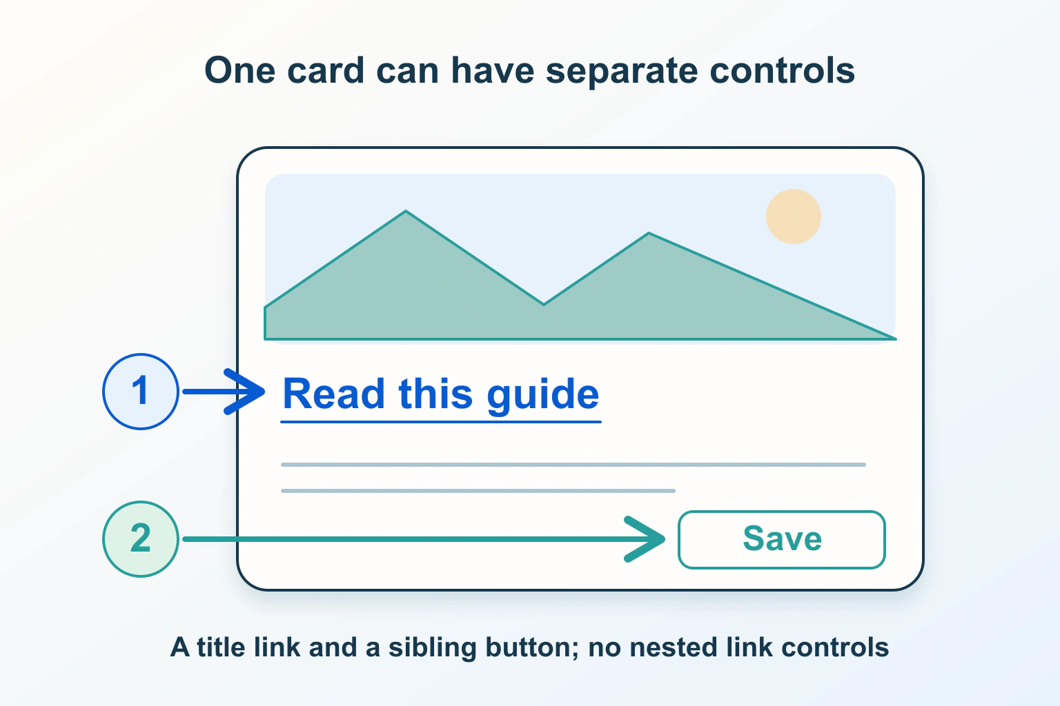
A resource card looks simple until it needs a second action. The title should open a guide, a category should open a topic page, and a bookmark button should save the item. Turning the entire surface into a single interactive wrapper can make those intentions collide. The solution starts with identifying the actions, not with adding more click handlers.
This guide uses a fictional resource library. Its review matrix is proposed acceptance work, not a claim of testing a particular design system. It addresses the interaction contract of a card; choosing its image crop and grid spacing remains a separate design task.
Count destinations before selecting a card pattern
Write down what each visible control does. Opening the guide is navigation. Saving it is an action. Opening its category is another navigation destination. If you cannot describe these three outcomes separately, the visitor is unlikely to understand them from the finished card.
For a card with one destination and no other controls, a single link may be a reasonable starting point. Once independent actions appear, prefer a non-interactive card container with meaningful links and buttons inside it. Do not make the whole container a button simply because some area should be easy to click.
The current WHATWG definition of the anchor element excludes interactive descendants, another anchor and descendants with a specified tabindex attribute. Therefore a bookmark button inside a surrounding guide link is not a valid way to express two independent controls. Stopping an event from propagating does not change that content rule.
Make the primary link useful on its own
A real hyperlink has a destination that the browser and visitor can work with. MDN’s anchor reference describes hyperlinks created with href and the navigation behavior associated with them. Start with that native foundation rather than requiring an arbitrary container’s script to imitate every link affordance.
In the example, the primary link is the resource title, such as Prepare a website migration checklist. Ask a reviewer to find it using only the keyboard and to open it through the browser’s normal link commands. Also ask them to copy its address. A card that works only after one particular kind of click has not preserved the ordinary navigation contract.
Keep any decorative arrow subordinate to the named link. Avoid introducing another focus stop that sends people to the same page without additional purpose. An image and title can share a clearly designed destination, but count the actual interactive controls rather than assuming the visual card is one control.
Choose names that distinguish the actions
The W3C explanation of Link Purpose in Context says link purpose must be identifiable from its text or programmatically determined context, with the stated ambiguity exception. It recommends meaningful link text and explains how that helps people choosing from a list of links. The visual presence of a card is not by itself a descriptive link name.
For this library, use the resource title as the primary navigation label and name the independent action Bookmark this resource. Consider what remains understandable when a person encounters the controls separately. If a row of cards exposes only identical Open links, ask how each will be distinguished without relying on where a mouse happens to hover.
Do not solve an overly long accessible name by hiding the whole card’s useful description from assistive technology. Separate the text, primary navigation and secondary action in the design. This makes the review much easier: each element has a reason to be present and a clear job.
Expand the hit area only after protecting other uses
A larger main-link area can be convenient, but it is a design tradeoff. An overlay or stretched area needs deliberate testing around secondary controls and ordinary text selection. Treat it as an enhancement to the real link, not as permission to place interactive elements inside one another.
Ask whether a reader can highlight a sentence in the card, use a secondary link and see which destination the pointer is over. If the expanded region swallows those operations, return to an explicit title link and a visible reading action. A slightly smaller predictable target is preferable to a broad region with several competing meanings.
Give the developer a drawing showing which areas belong to each action. Empty space, a category label and a bookmark icon should not accidentally perform the same task. The drawing is an implementation requirement; the finished page still needs observation with the actual layout, zoom and content length.
| Proposed check | Wanted outcome | Failure to investigate |
|---|---|---|
| Open the main title | The resource page opens | A script-only target with no usable address |
| Activate Bookmark | Only the bookmark changes | Unexpected navigation as well |
| Open the category link | The category destination opens | The primary hit area intercepts it |
| Select the description text | The intended text can be selected | Selection unexpectedly opens a page |
Review focus order and visible feedback together
Tab through a representative card and then its neighbor. Record each focus stop and the action it performs. Check long titles, missing optional images and a card with every supported secondary control. A polished example with one short title does not reveal what a busy resource library will do.
The visible focus treatment should make the currently active control understandable. If a keyboard user focuses Bookmark, highlighting the entire card as though Open is selected can be confusing. Ask the designer and developer to agree on feedback for each control, then compare the implemented behavior with that agreement.
Repeat the relevant checks on a phone and after zooming. The practical question is whether the visitor can still choose the intended action without ambiguity. Record actual supported browser and assistive-technology testing separately; this checklist alone is not a certification of accessibility.
Keep the pattern consistent as cards gain features
Document the permitted card variants: a single destination, a primary link with secondary navigation, and a primary link with an independent action. Require a fresh interaction review before adding a menu, checkbox or quick preview. That prevents a harmless visual component from gradually becoming an undocumented bundle of nested controls.
Use our related guides to Write useful image alt text: context, links, decoration and complex diagrams, External links, new tabs and contact actions: make the handoff predictable, and Small buttons and drag-only controls: make website actions easier to use for the adjacent details. The acceptance result for this guide is specific: each card offers the intended navigation and actions, with valid relationships and browser behavior that readers can predict.
Sources and verification
Editorial review 2026-10-15. Source check dates are recorded separately. Notes describe what each source supports and its limits.
View sources
- WHATWG — The a elementChecked An anchor cannot contain interactive descendants, other anchors or specified tabindex descendants.
Limits: Valid markup alone does not prove usable card interaction. - MDN — HTML anchor elementChecked Native hyperlinks expose URL-based navigation and browser affordances.
Limits: Focus and overlay behavior must be verified in the actual design. - W3C — Link Purpose in ContextChecked Link purpose must be identifiable from text or programmatically associated context.
Limits: Does not mandate a particular card layout.