
Reproduce the blocked task on a real phone, identify which viewport and scroll container govern the obscured control, and remove unnecessary fixed positioning before adopting a tested viewport-specific adjustment.
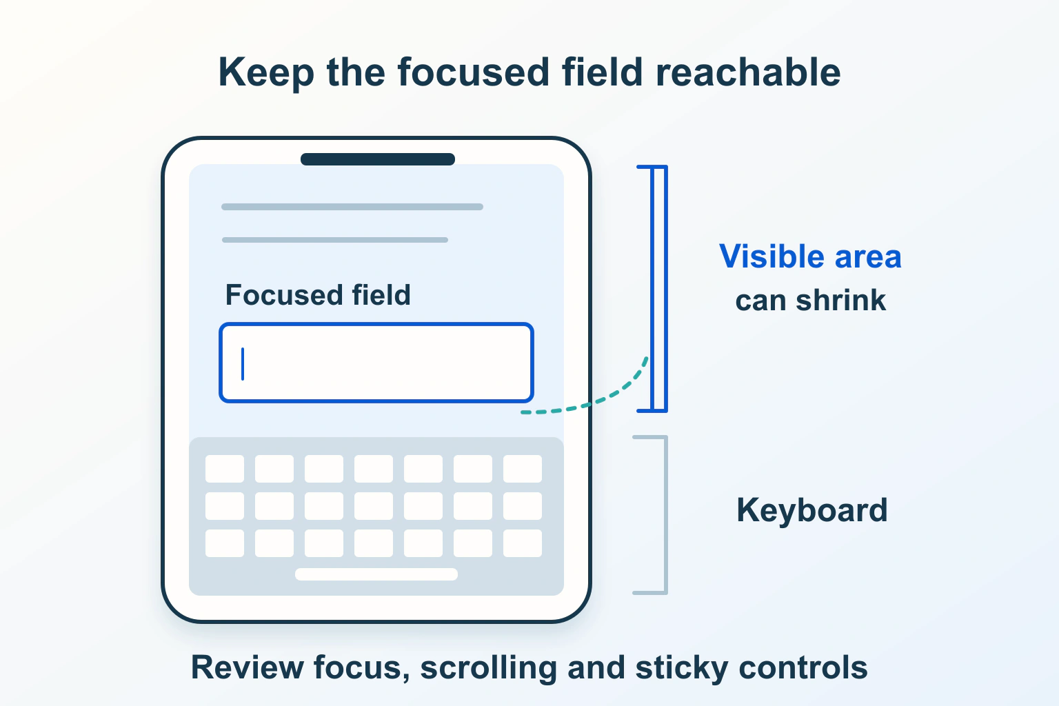
The mobile keyboard can cover a website’s next action even when the page looks tidy at phone width. Diagnose the typing journey with the keyboard actually open. A smaller desktop window cannot reproduce every operating-system keyboard, browser toolbar and focus behavior.
Start with the blocked task rather than a new height formula. This guide uses a fictional repair-enquiry form: the visitor enters a description, corrects an email address and reaches Send enquiry. Its proposed checks are examples, not results from a real device test.
Describe exactly what becomes unreachable
Separate a field hidden when focused from a button that cannot be scrolled into view. Also distinguish a control that is visible but covered by another element. Those symptoms can have different owners: the form layout, a floating notice, a dialog’s scroll container or a script moving the page.
Write the starting state, field tapped, keyboard state and failed next action. Record the phone, operating system, browser version, orientation and whether the page is in an ordinary tab or another supported display mode. Note whether the problem happens immediately, after validation or only after switching fields.
For the fictional form, an actionable report says: after focusing the last field in portrait, the error message is below the keyboard and the dialog cannot scroll farther. It does not claim that every mobile keyboard fails or that the hosting service caused the obstruction.
Separate the layout viewport from the visible area
MDN’s VisualViewport reference distinguishes the area used for layout from the portion currently visible. Pinch zoom and an on-screen keyboard can reduce the visual viewport without resizing the layout viewport. Its dimensions, offsets and scale help describe that difference; resize and scroll events are observation points.
That explains how a bottom-fixed action can remain aligned to a layout boundary while the reader sees less of the page. It does not establish the cause of your particular obstruction. Measure the focused control and the overlapping surface as well as the reported viewport.
A height change alone is not a dependable keyboard detector. Zoom, browser-interface changes and orientation can also alter the available view. Avoid a repair that reacts to every resize by forcing scroll or moving focus. Such a repair can fight the reader while they enlarge or navigate content.
Find the element that owns scrolling
Ask the maintainer to identify whether the document, an open dialog or an inner panel is supposed to scroll. Inspect fixed heights, maximum heights, overflow rules and any background-scroll lock. A long form inside a non-scrolling panel needs a different repair from an ordinary page with a floating footer.
In the example dialog, the reader should be able to reach the last input, its instructions, the correction message and the action. If a parent panel clips the content, adding space to the document may not help: the document is not the scroll surface the reader can use.
Check the same route without the decorative fixed bar on an authorized test copy. If the obstruction disappears, that isolates a useful responsibility without proving the entire form correct. Prefer returning optional controls to normal flow or simplifying the overlay before creating a script that continuously tracks the keyboard.
| Observed problem | Responsibility to inspect | Avoid assuming |
|---|---|---|
| The focused field is visible, but its error is clipped | Field group and scroll-container height | Focus visibility covers the whole correction task |
| A floating action overlaps the input | Fixed action and available reading area | More bottom padding fixes every mode |
| The page repeatedly jumps while typing | Focus, resize and automatic-scroll code | Every movement is required by the browser |
| A frame works directly but not when embedded | Frame and containing-page layout separately | Top-level viewport metrics describe the embedded form |
Treat viewport units as a layout choice
MDN documents small, large and dynamic viewport units, including svh, lvh and dvh. They address different browser-interface viewport concepts; dynamic sizing can change as that interface changes. Replacing vh with dvh is therefore not a universal promise that every virtual keyboard will be subtracted.
For a form, first ask whether it needs an exact screen-height container at all. A content-driven page with enough room to scroll may be easier to maintain than nested full-height panels. Where a height constraint is necessary, define which panel it applies to and what happens when content exceeds it.
Review long labels, a multiline message and validation text together. Do not evaluate the new unit only on an empty form. A layout that fits before typing can still conceal the lower half of a correction message.
Review a resize hint only after choosing the behavior
The viewport metadata reference describes interactive-widget values: resizes-visual is the default, resizes-content asks for content-viewport resizing, and overlays-content leaves the viewports unresized by the widget. These are behavior hints to review against current browser support, not interchangeable fixes.
Have the maintainer inspect the existing viewport declaration in its owning template. Preserve device-width sizing, the intended initial scale and reader zoom. Adding contradictory declarations in a plugin and theme makes the effective behavior harder to explain. Do not disable zoom to hide the defect.
If a supported resize choice solves the example, repeat other forms and open menus before release. Resizing the layout may also affect nearby full-height components. An overlay choice increases the site’s responsibility to keep content reachable; it should be a deliberate design with a fallback.
Build an acceptance route that includes correction
- Open the page on each supported real phone/browser combination with the keyboard closed.
- Focus the first field, then the last field, and enter harmless test content.
- Trigger a recoverable validation error using an authorized test route; find and correct it without losing the relevant context.
- Check that the next action can be reached by scrolling, without requiring an unexplained keyboard-dismiss gesture.
- Repeat in landscape, with enlarged content and after switching between field types.
- Close the keyboard and verify that no permanent gap, covered link or displaced action remains.
Include keyboard suggestions or autofill in the combinations the site supports. Record what was actually observed rather than marking all mobile cases passed after one phone. Browser emulation helps identify constrained layouts, but it does not replace the operating-system keyboard check.
The accessible-form review covers labels, correction and confirmation. Our autofill guide covers field purpose and grouping, a separate responsibility from available screen space.
Release a scoped repair and keep its evidence
Keep the previous template or component style recoverable. Identify the changed rule, supported devices checked and remaining limitations. If the new positioning introduces jumping, lost focus or another blocked action, return to the known version while the maintainer narrows the cause.
Retest representative pages using the shared component. The mobile text and zoom checks should still pass. The useful outcome is a reader who can enter, correct and finish the task with the keyboard open, not merely a footer that appears above it in one screenshot.
Sources and verification
Editorial review 2026-10-15. Source check dates are recorded separately. Notes describe what each source supports and its limits.
View sources
- MDN: VisualViewportChecked Layout versus visual viewport, visible dimensions and offsets, scale and resize/scroll observations.
Limits: A smaller viewport does not establish keyboard state; the top-level distinction does not transfer directly to an embedded frame. - MDN: viewport metadataChecked Interactive-widget resize/overlay hints and preserving reader zoom.
Limits: A documented value is not a universal browser-support promise; behavior must be checked on the intended devices. - MDN: CSS length valuesChecked Small, large and dynamic viewport-relative lengths.
Limits: Dynamic browser-interface sizing is not a guarantee that an on-screen keyboard is always deducted from a component height.